Sunday, March 27, 2011

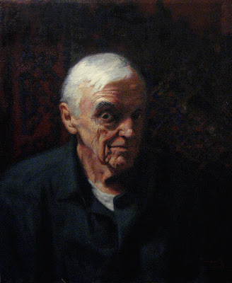
Bill, a portrait.

This is a recent portrait commission that I've finished.

I learned a lot about what I should and should not do in a painting, let me share with you:

The tooth of the canvas was a little to thick...
In trying to overcompensate for painting too thin, I got a thicker "tooth" canvas. This was a mistake, I could have worked on thicker painting just the same if I had been mindful, and had done it on a smoother canvas. Ultimately though, the affect is minimal. The painting is either good or it isnt, and the tooth is one of the finer points which isn't going to make or break it.

Drawing from life, painting from photo's...
We can't always work from life the way we want, where I went wrong in this was working first from life, with the drawing, and then working from a photo with everything else. Because I'm not an experienced painter I thought this would have been better for me in the working process. I was very wrong. In setting up sight size, I could have made important anatomical notes, and then done the finer details and shapes off of a photo. Because the client travels a lot, the time I did have with him would have then been spent getting color and form with the paint. I found this lesson out the hard way and ended up struggling more than I should. Draw from photo's, paint from life...if you have to.

Shadow's and background...
Need to be treated similarly, and painted thinner than the lights...duh...to be fair I did try to do this, but it wasn't successful. The background I loaded up with too much paint, to compensate for the thick canvas, and I didn't blend the shadow of the figure in with the background like I should to make the shadows seem more atmospheric.

Plains plains plains...
From having had to paint from photo's, a manner of compression happens in the shot, and the plains of the form are harder to read than from studying the sitter from life. Successful figure painting is in part being able to observe the plains of the form and to get those to read well with one another. As a painter, you will likely always struggle with this, I did because I'm not experienced and I chose the wrong way to go about working.

Expression of the sitter...
I have talked before about the boring and traditional academic portraits which litter the landscape of the painting world, where the sitters are completely void of expression, boring and lifeless. Well I had this in mind when painting this portrait, and I told Bill, to "think of something dirty..." when I was drawing him, and taking the reference shots. I feel like I got an expression which makes Bill look as if he's about to lean forward and share with you something that may just make you blush. Of all the problems with this portrait, I'm happy with the expression, and I'm happy to say that I was able to make the drawing better while painting.

Well, there we go. Lets just say, it could be worse, I wanted it to be brilliant, which it isn't but it's also not a complete disaster either.

Tuesday, February 1, 2011

A Portriat. The final stage

Here's the finished portrait. Having touched up the shapes as best I could I moved on to other things like his shirt and neck line.

Notice the hair, even at the final stage, it still remains soft. I could even say that the hair line should have been softer now that I look at it smaller and more simplified. Look at any portrait of an accomplished painter of the 19th century and the hair line, and hair itself will be very soft, and very simple.

An important note on shadow: shadow is atmosphere, repeat that as your mantra when considering what to include in shadow. You never need to include as much as you think. Beware of reflected light as too much will ruin the atmosphere.

The general impression is good, and I got the likeness to what I wanted. This is though, your run of the mill academic portrait in all of its boring glory.

I could make the excuse that It was a practice run having been out of drawing for a number of months, which is a good enough reason. What it's lacking is expression, a sense of life and vitality.

No amount of technical skill will be able to take the place of energy in a painting. Two great examples of this are painters who were rivals of one another, Ingres and Delacroix.

Ingres was technically the better painter, he was very tight in his paintings, and overall he was boring in most of his compositions. Delacroix on the other hand, wasn't technically as good, but his work has an energy to it that Ingres is severely lacking.

If you spend your life painting figures, people are going to come to you for technique, if you paint pictures, people will go to you to be moved. Tell a story, or paint a figure. The portrait that I've done here can be said to have some technically appealing aspects to it, yet it will remain boring because it doesn't have life.

This comes to one after the fact. Of course, if this is what the person wants you to do in a portrait you have little choice, but if you're able, even if it proves more difficult, always go for the more interesting pose. Portraits should capture the life of the sitter.

Monday, January 31, 2011

A Portriat. The fifth stage

At some point during a drawing on toned paper you have to start using white charcoal, this stage can be rather fun, and it can be easy to forget that despite how fun it is to add this kind of contrast in the drawing, and is fairly easy compared to a white paper drawing, it's just as important to be rigorous and exact in its placement.

White charcoal has as much intensity of range as black charcoal, and it's important to never mix the two. It's a toned paper drawing for a reason, use the tone of the paper for the intermediate tone between the two contrasts.

In moving towards adding detail, such as the eye lids, its important to remember that the only reason for doing this is to make sure that the entire shadow shape around the eye is correct. This is the same for the tone on the side of the face running from the cheek bone to the chin.

This tone was added only to make sure the frontal plane of the face was the correct width.

At this point I'm going at the drawing with all the tones I can get out of my materials. Going for the darkest darks, and the lightest lights and at the same time constantly redrawing.

A note on technique:
It is of my opinion through my limited experience and my observations of my favorite artists, that charcoal strokes (and brush strokes) should follow the form. If the texture follows the form it is describing, it gives it a far more naturalistic look.

People who are obsessed with brush strokes for the sake of it have forgotten the purpose of them all together. Look closely at a Bouguereau, the strokes in his work resemble what they are actually trying to describe, than just outright brush strokes. The same is true of charcoal.

Sunday, January 30, 2011

A Portriat. The fourth stage


Here, all the same points I made in the very first stage, are the ones I'm still considering and adjusting in the later stages.

I have yet to get any more detailed, but notice, the red dots are variation of line weights, all the lines are still straight, but have been broken up into smaller straight lines, and their relationship to one another is something I'm considering more now.

The tones are now definitely broken up into three variations, as denoted by the blue lines: darkest dark which blends from the background and into the hair, the paper tone which is the middle tone of the drawing but for now is being used as the light tone, and a tone in between the two which helps in smaller shapes to connect the bigger ones, adjust major rhythms, and help in some of the soft transitions from one shape to the other.

I'm continuing to look at everything as a whole, abstracting the shapes so that they are something else. I'm trying here not to look at the forehead as a forehead but as a giant letter M, or the chin leading up into the bottom lip as a whale throwing its tale over its head.

It sounds silly, but abstracting the shapes, and then comparing them to one another is a key element in getting a more precise drawing. We believe we know what these things are that we draw, we have preconceived notions of cheeks, chins, foreheads, and noses; we tend to make generalizations as we transcribe what we see. But the longer one studies these shapes, the more they seem to change, what is really happening is that we're coming to see the more exact shape, but this takes looking at it over and over again.

A Portriat. The third stage


The next stage, I'm squinting down, looking and adjusting the major masses and have progressively gotten darker the more confident I've become.

Everything has to do with the overall big shape, and in getting a likeness, I'm forcing myself not to think of the details. Everything still is generalized even with the tone, this is so that I don't become too attached to anything too early in the drawing.

In keeping things simple, notice how many straight lines there still are, be they soft or light, faded into the background or sharp to denote a major change in form, the lines are still straight, giving it a boxy look. Most variation that can be found in the form can be easily changed from a straight line. In some instances the "illusion" of variation can be achieved all from simply adjusting the weight of a single line in places where the variation calls for it.

As I begin to get darker with my tone, I'm introducing tertiary tone to begin mapping out smaller shapes inside of the larger ones such as in the forehead and cheeks.

A Portriat. The second stage


When it comes to tone, It can be tricky because depending on how adept the person is in painting and handling masses, one could jump to tone rather quickly.

In a portrait, I've found that I've had to jump ahead and combine stages that I wouldn't normally with the figure because of how much less of the body I'm working with.

Notice even here, and all the way through, I'm still considering my edges and how that impression is reflected in nature.

The major shapes are all there, at this stage I'm just pushing them around and adjusting them in relation to themselves and the overall shape of the head.

I'm working only in two tones, a slight shadow tone which is blending with the surroundings, and the light "tone" which is everything else.

Since it becomes a bit easier to see the drawing when tone is introduced, and the greatest strength in using sight size, I flick my eye back and forth from the drawing to the model. Think of how animators flick from drawing to drawing to see movement. The same is true of this technique.

Get into the right position where the horizontal points match and then stare at the model, flick the eye quickly from the model to the drawing and then back again. Stare at the model more than the drawing. After a while of doing this you should be able to memorize what is different between the two, and make the needed changes. This is easier to do in tone as you begin to work in masses.

As my instructors tell me, try not to think, react. Go with the first impressions and don't intellectualize it.

Tuesday, January 25, 2011

A Portriat. The first stage


I'm going to show the stages of a portrait I did from start to finish.

The red dots indicate key measuring points.

Having set up my paper right next to the model working sight size, I line up the horizontal points being:

1.) The top of the hair line (with very little indication, if at all, of the actual top of the hair, or head, seeing as in this case it's going to change with every day the model sits)

2.) The eyebrows. Since using overhead light, the eyes have a cast shadow over them. Keep in mind what you're drawing, a head with a skull underneath it. The sockets of the eyes are set in under the brow line. This creates a large land mark. When squinting down it's the first thing one will see under overhead lighting conditions.

3.) Nose, it casts a shadow down to the lip, which I was not too concerned with finding right away. It might not be seen here but I did make a slight indication of the actual width of the lips in line with where the cast shadow of the eye sockets dropped down from. This is key to see how the face is turning, and subtle shifts of the head.

4.) The Chin. Major bony landmark.

5.) Pit of the neck. It's not going to move unless the whole upper body moves with it, this is good for lining things up and making sure the model is in the right place.

Next I went for the widths, being the side of the face where the cheek bones, or Zygomatic Process forms the larger part of the of the actual face, note though, that this is leading up to the Temporal line of the Parietal bone, which is the widest part of the skull in a front-on portrait. Were the model bald, I would have gotten this point specifically.

The blue lines indicate rhythms of the face where cast and form shadows run through the head, and helps to map out key anatomical points. Rhythms in the body are important to shoot for as rhythms tend to reveal where mapped out landmarks need to be adjusted. If a line can be seen which runs through the entire face, which forms a rhythm, and other points don't match up, it says the drawing needs readjustment.

Just keep in mind that it always needs readjustment. Don't get attached to anything at this point. Change anything which needs it without a thought, and squint down to simplify the forms and impressions constantly.

My materials are:
Firenze cotton charcoal paper
Nitram Fusain charcoal
A regular and black mirror to look at the drawing from different perspectives.
A measuring stick.
Robert Simmons fan brush to soften edges.